Blog Post 2
Introduction
Hello!
This is the second blog post for Brown University’s CS1951a Data Science Final Project.
The students in our project group are: Jack Kates, Julia Windham, Leo Ryu, Nam Do, and Sandra Ha.
ML Analysis
In order to analyze the data, we used a basic sentiment analyzer as a metric of both negativity and polarity and retweets as a metric of popularity and attention.
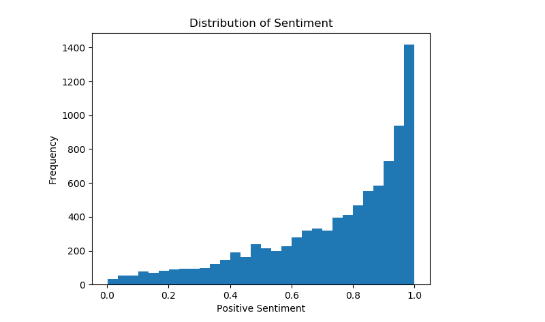
We began by analyzing the distribution of positivity across all the tweets collected. We wanted to understand how the pre-trained sentiment analyzer scored our data, and whether it was evenly distributed across the scoring scale of zero to one. As demonstrated in the bar chart, the tweets skew towards being more positive. This is important to note because in the scatter plot below, the same skew is present but is more difficult to isolate.
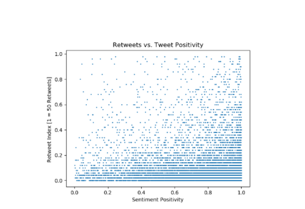
The tweets’ retweet counts, as seems natural, are greatly distributed but skew towards smaller values. From this visualization, the skewing along each axis is apparent, but it is difficult to tell if there are any trends besides this.
Insights
We notice that there is a skew in both the number of retweets and the positivity of the tweets. This is useful, because now we can do more to change our way of presenting the data and hopefully ascertain a clearer vision of what our actual hypotheses are. As seen in the charts above, we note an exponential increase in frequency of tweets as positivity scores increase. Similarly, we see a high density of tweets with few retweets.